In today’s digital age, having a website that looks great and functions well on all devices is crucial. This is where responsive design comes into play. In simple words, Responsive design is an approach to web design that aims to provide an optimal viewing and interaction experience across all devices, including desktops, laptops, tablets, and smartphones.
In this blog post, we’ll take a closer look at responsive design, its benefits, and how Fameweb can help you create a responsive website that meets your business needs.
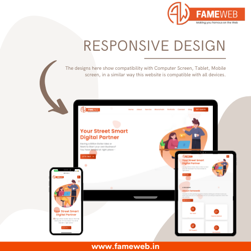
What Is Responsive Design?
Responsive design is a web design approach that enables websites to adapt their layout, content, and features based on the device and screen size of the user. With responsive design, a website’s layout and content will automatically adjust to fit the screen size of the user’s device, providing an optimal viewing experience.
The responsive design achieves this by using a combination of flexible layouts, images, videos, and style sheets (CSS) media queries. Media queries allow designers to specify different CSS styles based on the size of the screen, enabling them to create a website that looks great on any device.
Why Does Responsive Design Matter?
There are several reasons why responsive design matters. Here are some of the key benefits:
- Better User Experience: Responsive design provides a better user experience across all devices, which can lead to higher engagement and conversion rates.
- Improved SEO: Google has stated that responsive design is a must for mobile configuration. It can help improve search engine rankings significantly. A responsive website also makes it easier for search engines to crawl and index your content.
- Cost-Effective: With a responsive design, you only need to create one website that works on all devices. This is more cost-effective than creating separate websites for desktop and mobile users.
- Future-Proof: As new devices with different screen sizes and resolutions are introduced, a responsive design will automatically adapt to these changes without requiring any additional work.
Which Technology (tech stack) Do You Use to Build a Responsive Website?
Choosing Right Technology or Tech Stack plays a very important role when you are getting your website/app/product built. Your tech stack can be anything from HTML,CSS,JS, React.js, Next.js, Angular.js in the Frontend. PHP, Nest.js, Node.js, Python etc. in the Backend choosing Database from MongoDB, MYSQL, Postgres etc.
Choosing the technologies for development makes a tech stack.
Fameweb: Your Partner for Responsive Design
At Fameweb, we understand the importance of responsive design for businesses of all sizes. Our team of experienced designers and developers can help you create a responsive website that meets your business needs.
We follow a proven process that involves:
- Understanding Your Business Needs: We take the time to understand your business, your target audience, and your goals. This helps us create a website that meets your specific needs.
- Designing the User Interface and User Experience: Our expert designers use Figma as a designing tool to design screens of your website/mobile app that show how your website will actually look after development across all devices.
- Developing Your Website: Our team of developers will build your website using the latest web technologies and best practices like clean code, comments etc. We will ensure that your website is fast, secure, and optimized for search engines(which is very important).
- Testing Your Website: We will thoroughly test your website on multiple devices and browsers to ensure that it works flawlessly.
- Deployment of Website: Once your website is complete, we will deploy the code on the hosting platform such as cpanel or AWS hosting
- Launching of Website: Now you are ready to officially launch your website on all marketing channels.
- Support: We are always ready to provide ongoing support to ensure that it continues to perform well.
Conclusion
Responsive design is a must-have for any business that wants to provide a great user experience and stay ahead of the competition. With a responsive website, you can ensure that your website looks great and functions well on all devices, regardless of screen size or device type.
At Fameweb, we can help you create a responsive website that meets your business needs. Whether you’re looking to redesign your existing website or create a new one from scratch, we have the expertise and experience to help you succeed.
3 Comments